Download Waterfall chart Template In Excel

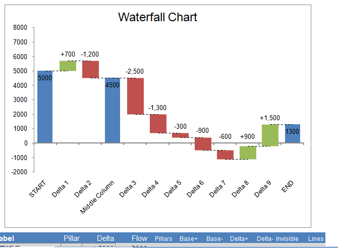
waterfall chart is a form of data visualization that helps in understanding the cumulative effect of sequentially introduced positive or negative values. These intermediate values can either be time based or category based. Therefore waterfall chart is also known as a flying bricks chart or Mario chart due to the suspension of columns (bricks) in mid-air and in finance, it is called a bridge.

Complexity is add to waterfall charts with multiple total columns and values that cross the axis. Increments and decrements that are sufficiently extreme can cause the cumulative total to fall above and below the axis at various points. Intermediate subtotals, depicted with whole columns, is added to the graph between floating columns.

Waterfall chart Visualization in excel

Waterfall Chart or Bridge Chart can be a great way to visualize adjustments made to an initial value, such as the breakdown of expenses in an income statement leading to a final net income value. The initial and final values are columns with the individual negative and positive adjustments as floating steps. The connecting lines between the columns make the chart look like a bridge with two or more pillars. When analyzing net profit for a product starting from a sale price, where all the adjustments are negative, the chart often resembles a waterfall.

 Features of Waterfall chart

  • Allows negative values
  • Includes dashed horizontal connecting lines
  • Includes data labels formatted to show + and – adjustments
  • Define intermediate values by placing an “x” in the Pillars column.
  • Add new values by inserting rows and copying formulas down
  • No macros

Using the Chart in Another Workbook

If you want to use this chart in an income statement or some other workbook that you are using for your own private use, you can copy the entire waterfall worksheet into your other workbook and use cell references to link values in the data table to values in your statement.

Using the Waterfall Chart Template

Easy Stuff

All you need to do is edit the Labels, the Delta values, and place an “x” in the Pillars column. This is if you want to display an intermediate value.

Inserting/Deleting Rows

To insert new rows, just right-click on a row number and select Insert Row. Then immediately press Ctrl+D to copy all the formulas from the previous row.

The first and last rows use unique formulas. Therefore, you should not delete those rows, and when you insert a row, insert new rows somewhere between the 2nd row and above the last.

Editing Column Widths

The pillars are created using a Column Chart series (or a Bar Chart series in the vertical chart). So, you can edit the width by adjusting the gap percentage (Format Data Series > Series Options).

The positive and negative adjustments are error bars. You change change the width by editing the line width for the Base+ and Base- error bars (Format Error Bars > Line Color and Line Style > Width).

Editing Label Positions

The data labels are displayed using invisible stacked columns. If the data labels don’t end up where you want them, you can manually change the location of each individual data label by dragging them with your mouse.

Formatting Data Labels

The data labels for the negative adjustments use a custom number format of “-#,##0;-#,##0” to force the values. However to show the negative sign “-” even though the actual values in the data table are positive .Why? To get the data labels position conveniently, the values for the stacked columns are positive, so we force the labels to include a negative sign.

Download this Waterfall chart template in Excel Format

Our easy to use editable Excel templates and save your significant amount of time and effort. Here’s how to download and use one of our templates:

  1. Download this free Excel Template: Once you’ve browsed through our collection of templates and find the one that best fits your needs. Once you’ve found the template you want, click on the download button.

  2. Replace sample data with your actual data: Once the template is downloaded, open it in Excel. You’ll see that it is already set up with sample data. To start analyzing your own data, simply replace the sample data with your actual data.

  3. Customize the template: Our templates are completely editable, which means you can customize them to fit your specific needs. For example, you can change the formatting, add or remove columns, or create new charts and graphs.

  4. Use the Excel template: Once you’ve fed in your data and customized the template, you’re ready to start using it for data analysis. Use the various tools and features of Excel to analyze and visualize your data, and make informed business decisions.

  5. Save and share: Once you’ve finished working on the template, save it to your computer and share it with other members of your team or stakeholders as needed.

Click Download Button To Get Waterfall chart Excel Template

Instruction :

All Excel templates and tools are sole property of xlsxtemplates.com. User can only download and use the excel templates for their Personal use only. All templates provided by XLSX templates are free and no payment is asked. However, you are not allowed to distribute or share in any other website for sole purpose of generating revenue from it.

 You can also download and use our 1000 Best PowerPoint Presentation Templates and 500 Resume Samples from PPTXTemplates.com  Completely Free. All our templates are designed by Professionals

Download Free Editable Excel Templates | Popular Templates

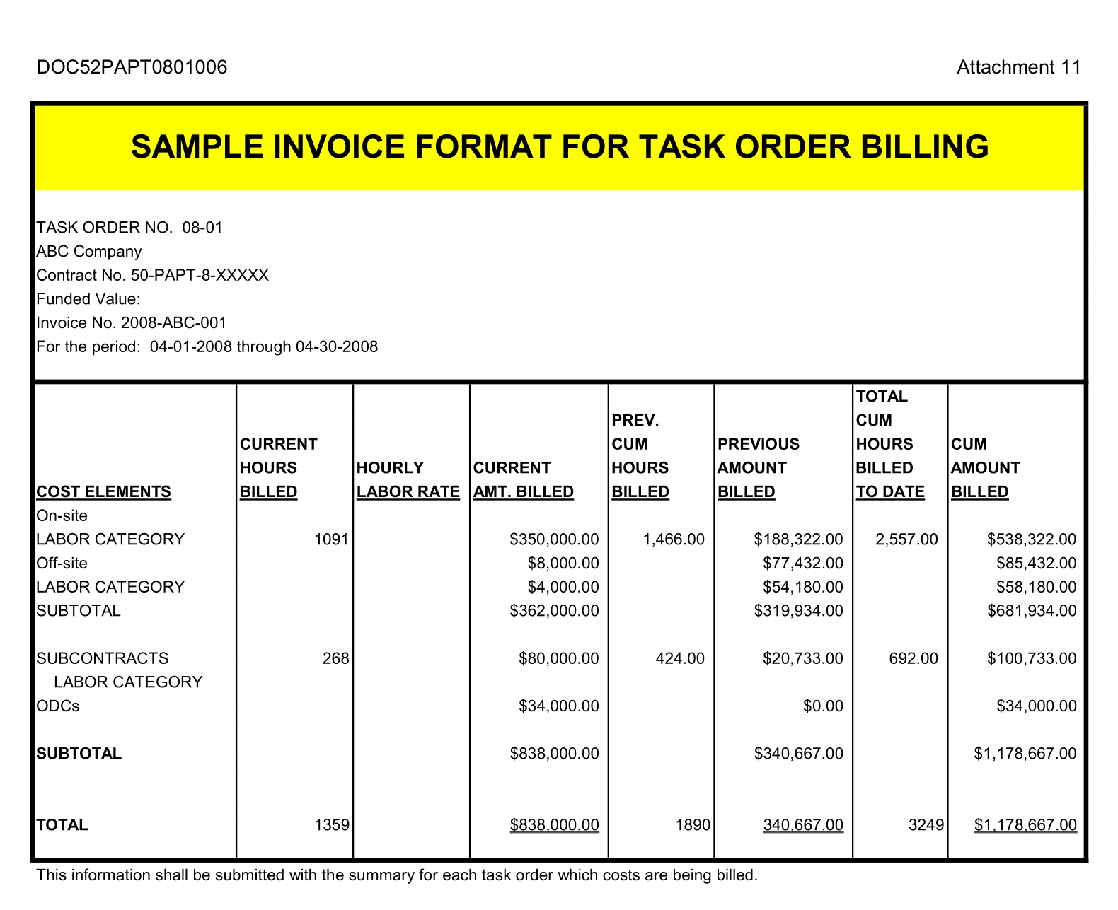
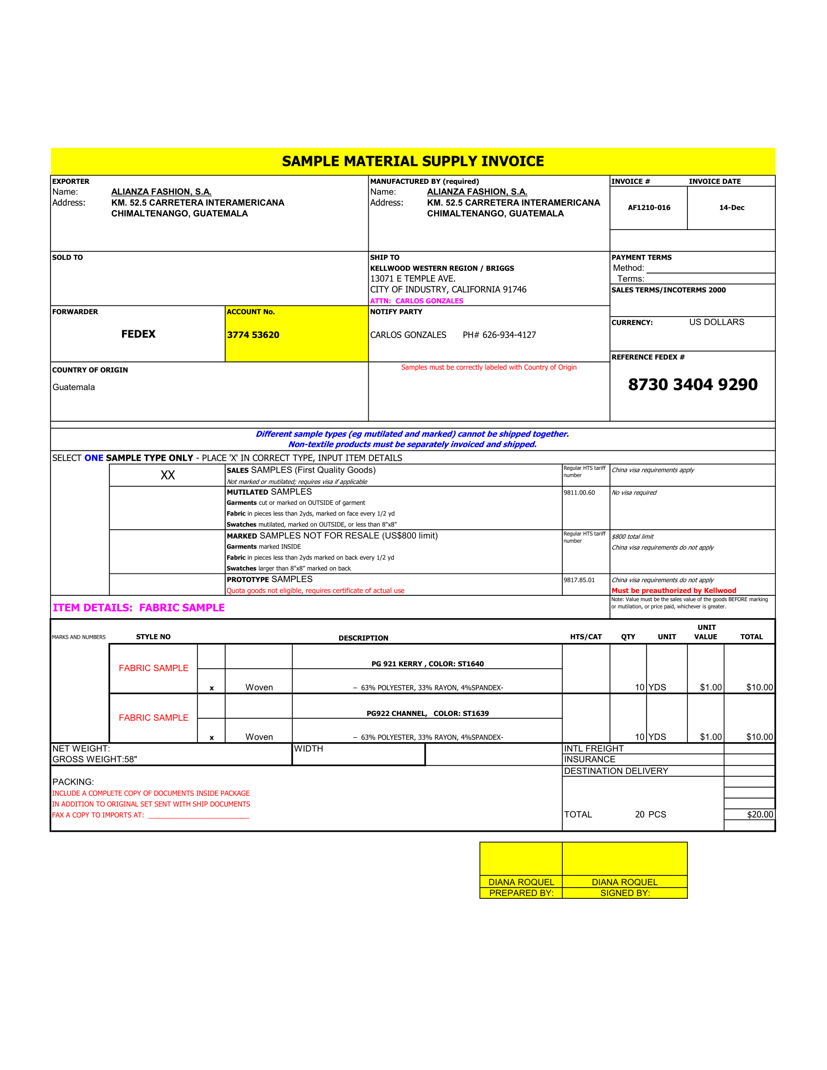
Task Order Billing Format

Task Order Billing Format

Task Order Billing Format Template: Your Key to Efficient Milestone-Based Invoicing In a landscape where project dynamics shift and evolve, billing clients based on project

Read More »
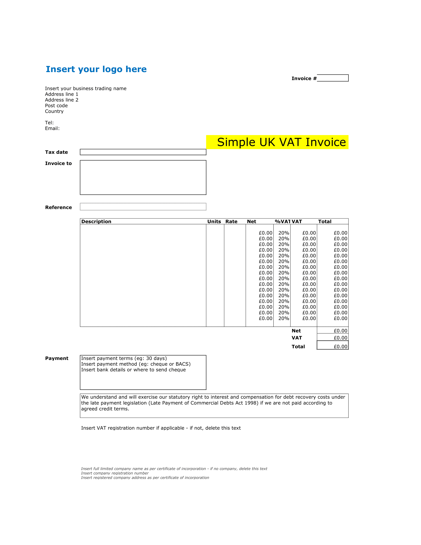
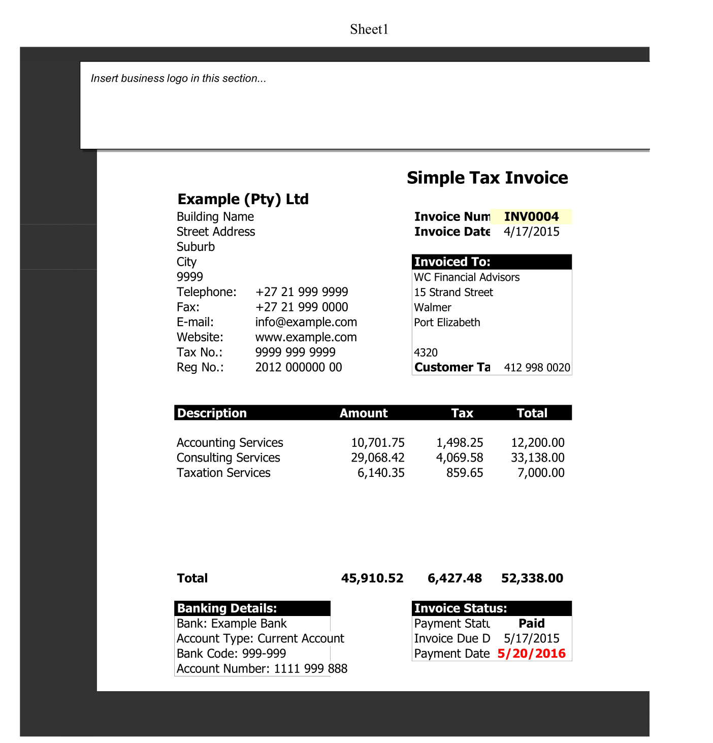
Simple Tax Invoice

Simple Tax Invoice

In the realm of business, clarity, precision, and simplicity can be the key to smooth transactions. A Simple Tax Invoice Template is designed to cater

Read More »

Free editable professional Excel templates can be a useful tool for businesses, organizations, and individuals looking to streamline their data management and reporting processes. These templates can provide a pre-designed and pre-formatted framework for storing and organizing data, as well as for creating charts, graphs, and other visualizations to help communicate that data more effectively.

One advantage of using professional Excel templates is that they are often designed by experienced professionals who understand best practices for data management and visualization. This means that the templates are likely to be well-organized, easy to understand, and aesthetically pleasing, which can make working with them more efficient and enjoyable.

Another advantage is that these templates are often fully editable, allowing users to customize them to meet the specific needs of their organization or project. This can include adding or deleting rows and columns, changing the formatting and layout, and adding custom formulas and functions.

Some examples of professional Excel templates that may be available for free include budgeting templates for personal or business use, project management templates for tracking tasks and deadlines, and sales tracking templates for analyzing and forecasting sales data. There are also a wide variety of templates available for specific industries, such as real estate, marketing, human resource, Payroll management and among others.

Overall, free editable professional Excel templates can be a valuable resource for anyone looking to improve their data management and analysis skills. By providing a pre-designed and customizable framework for storing, organizing, and visualizing data, these templates can help users save time and make more informed decisions.