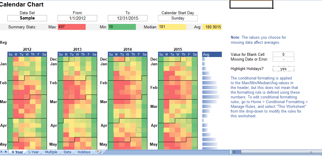
Calendar Heat Map Chart: Visualize Your Data Through Time with Excel
When you’re working with large datasets, visualizing the data can be as important as analyzing it. Visual representations can help you see patterns and trends that may not be immediately apparent from the raw data alone. Enter the Calendar Heat Map Chart – a powerful Excel tool to visualize data over multiple years using color gradients. This post introduces a free, 100% editable Excel template for creating Calendar Heat Maps.
Why Use a Calendar Heat Map?
A Calendar Heat Map offers a unique and compelling way to visualize how a data set varies with the days, weeks, and months of the year. While Excel doesn’t offer this as a built-in tool, you can create your own using conditional formatting or use a handy template. Our template demonstrates how to create a Calendar Heat Map using conditional formatting, making it easy to paste your data into the Data worksheet, or use it as a starting point to define your own conditional formatting rules.
Creating Your Calendar Heat Map
Here’s a step-by-step guide on how to create your Calendar Heat Map using the Excel template:
1. Prepare Your Data
First, your data needs to be formatted correctly. This means a list of unique dates in one column and a numeric value in a second column. Using a Pivot Table can help get your data into this format.
Example: If you have financial transaction data with a Date column and an Amount column, use a PivotTable to sum all transactions for each unique date.
2. Data Entry
Once your data is prepared, simply copy and paste it into the Data worksheet in the template.
3. Choose a Data Set and Date Range
In the 4-Year and 1-Year worksheets, you can select the Data Set you want to analyze from a drop-down list. The list in the drop-down box is populated from the column labels you enter in the Data worksheet.
4. Customize Conditional Formatting
The colors in the Calendar Heat Map are generated using conditional formatting rules. However, you’re not limited to the default red-yellow-green heat map color gradient. The template allows you to modify the color schemes as needed.
Here are some tips for enhancing your heat map:
- TIP #1: Use percentiles and min/max thresholds to adjust the color range. Outliers can greatly affect heat maps, skewing the color coding.
- TIP #2: Use single-color gradients for data containing a lot of zeros to save ink.
- TIP #3: Use a color scheme that aligns with your data. Avoid using colors that may cause confusion.
5. Highlighting Holidays and Events
The Holidays worksheet lets you list dates that you want to be visible in the calendar, which are then highlighted with a dashed border in the 4-Year worksheet and only on the calendar in the 1-Year worksheet.
6. Handle Missing Data
It’s important to ensure that missing data (either missing dates or dates with blank values) are correctly represented in the chart.
Conclusion
The Calendar Heat Map Chart Excel template can provide an insightful way to visualize and analyze your data, making it easier to identify trends and patterns. By following the steps provided in this guide, you can create a customized Calendar Heat Map to suit your needs. This tool can be a valuable addition to your data analysis toolkit, providing a powerful visual aid for data interpretation. So why wait? Download this free, 100% editable Excel template and start visualizing your data like never before!