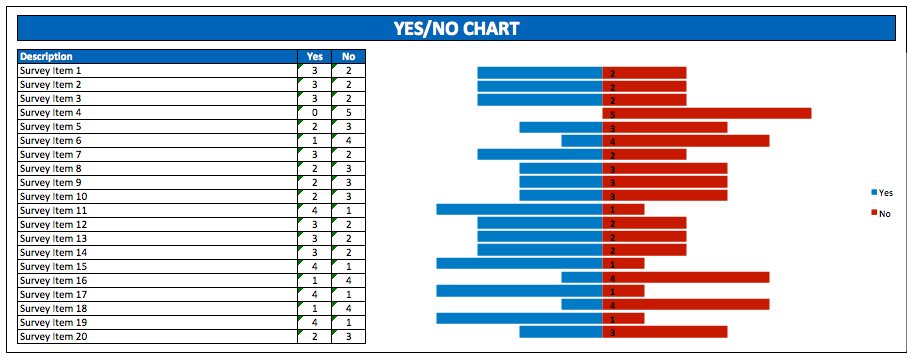
If you are working as a researcher or a marketing analyst, sometimes you have to collect data. Moreover it consists of “yes” and “no” answers and use it to analyze people behavior in certain areas. So, this Yes No Survey Chart is apt for you.
Survey Flow Chart
Since you only provide “yes” and “no” option as people answer, you should provides clear and specific questions in your questionnaire sheets so that you can have objective answers. This method is effective to narrow survey results and get a conclusion on survey topics quickly. Without having respondents give their own opinions. After gathering all require data from respondents, you should summarize and present these data with informative display to ease people understanding on reading your report.
Survey Process Flow Chart
One way to make it easy to understand is to display it in chart or plot it in a graph. And this simple yes/no chart template will ease your job. You should fill each respondent data in corresponding columns. I create 20 rows for questions item and 150 columns for yes/no answer which you can expand if you have more respondents. Once you finish filling all columns, you will see a yes/no graph with nice tornado style chart to help your customer, your marketing department or your superior make decisions based on it.

