Logarithmic graph paper is useful for creating charts with rapidly increasing or decreasing X-axis or Y-axis values in graph. In other words – a logarithmic graph allows you to fit really large numbers on the chart. This template contains semi-logarithmic graph paper in landscape and portrait orientation, as well as a ready-to-use tables, which allows to enter your values and instantly plot them on a Log chart in Excel.
Logarithmic Graph Chart Paper Contents
Here are the list of worksheets included in this template.
Semi Log Paper Graph Portrait
5-cycle, semi-logarithmic graph paper in portrait orientation.
Log Graph Landscape
6-cycle, semi-logarithmic graph paper in landscape orientation.
Log Chart with Values
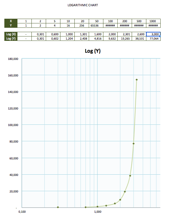
A ready-to-use logarithmic chart with options to enter up to 11 values for each axis, to plot on a chart using the “Log” function.
Graph Paper Logarithmic Paper
Personalize and Print
Add personal touch! Each worksheet has a built-in header. Use header to include information, such as name, title, and date.
The worksheets labeled “Log Graph Portrait” and Log Graph Landscape” are semi-logarithmic graph paper templates that are more useful for creating charts by hand. Go ahead and hit print – each tab is configured to print in its appropriate orientation type.
Plotting Graphs Paper By Hand
Once you have the semi-logarithmic graph paper print, additional labels are added by hand. In this example, we use the semi-logarithmic graph paper to plot exponentially growing human population and future population projection. The semi-logarithmic graph is useful for this type of chart because human population values are rapidly increasing, while number of years is linear, increasing at the same interval.
Log Scale Graph Chart Paper
Semi-Logarithmic Graphs
As mentioned, the two Log Graph worksheets in this template are best used as printouts for graphing by hand, but working in Excel in also an option. For example, our Log Graph worksheets have an exponentially labeled (logarithmic) X-axis, at x10 scale for each space moved to right, and a linear Y-axis scale.
To label the linear axis (Y-axis), insert a line to left of the graph and label numerically by typing number values into each cell along the axis.
You may also choose to plot simple chart in Excel by inserting lines and plot points.
To insert linear objects, select “Illustrations”, and then select “Shapes”, under “Insert” menu. I
Excel Logarithmic Chart Paper
This ready-to-use Log Chart makes your life easier. Simply enter up to 11 values for each axis into the table. Your values can be as big as you want because built-in log function will take those values, condense them into manageable numbers, and plot them out on a log scale.
The values enter are instantly plotted on a Log scale chart, using a line curve to illustrate this particular example.
Customize
Add Some Color (Log Graphs)
Background graph paper color can be jazzed up just way you like it. To modify graph paper background, select the area and use the “Fill Color” option, under the “Home” menu to charge the color of the grid.
Grid line color can also be changed by using the border tool. Click on “All Borders” and then select “Line Color” to change the color of the gridlines
Add Some Color (Excel Log Chart)
The Excel Log Chart, though not a graph paper, may be modified to your liking. For example, Right-click on log chart and select “Format Plot Area” to change line color (Border), chart background (Fill), and other chart features.
Titles
In addition to changing color of your chart, you may also want to add “Chart Title”, as well as title the X-axis and Y-axis.
Display Units
If you know that log value of your data will be large for both axes, you will need to expand the X-axis base display units in this chart. To do this, go to “Design” menu and select “Add Chart Element”. Next, select “Axes”, “More Axis Options”.

