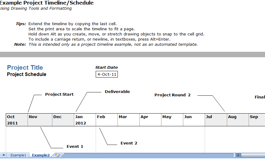
A project timeline chart is created in Excel using charts linked to data tables, so that the chart updates when you edit the data table. This template is a cross between my project schedule and task list templates. It is design for you to enter your own tasks and dates.
Project Timeline Excel Template
- Grouping Tasks Using Different Colors: One of the main features of this template is the ability to choose a different color for the bars in the timeline via drop-down box in the Color column. It makes easy to identify the different phases or categories of tasks. You can insert and delete tasks by just inserting or deleting rows in the spreadsheet.
- Milestones: With any project timeline, you are most likely to define at least a couple key milestones. You can edit the milestone labels and dates via data table. The template lets you show max upto 4 milestones. Adding more is possible but would require you to create the new data series yourself.
- Add More Colors: This project timeline is set up to allow up to 6 different color of your choices. Adding more colors is possible, but that must require more Excel experience. Some general steps to follow to attempt adding more colors:
- Dates Not Changing in the Chart? To edit the range of dates shown in the chart, you have to edit the Minimum and Maximum bounds of the horizontal axis. just Right-click on the axis and select Format Axis.
- Want More Flexibility? If you don’t care about automation and just want to make a simple way to create a high-level project timeline, you may want to try the Project Schedule Template. Colors are modify by just changing the background colors of the cells in the spreadsheet.
Project Timeline Chart
This project timeline uses two different chart series to display milestones above the timeline and tasks with durations below the timeline. The durations create using X Error bars. The length of leader lines for the tasks is define by the user to show task dependencies.
The vertical positions of the tasks and milestones are adjust by the users. This may work great for some timelines, but if you have more than 20 tasks to show, you may be better with using a Gantt Chart.

