Maximizing Sales Performance: Our Free Quarterly Sales Dashboard Template in Excel
Navigating the data-saturated business world can be a challenging task. To facilitate this, we’re excited to introduce our dynamic, user-friendly, and absolutely free Quarterly Sales Dashboard Template in Excel. This dashboard is designed with the unique needs of the sales and marketing team in mind, allowing for precise monitoring and evaluation of sales performance based on a range of key performance indicators (KPIs).
In this blog post, we will walk you through the distinctive features of this Excel dashboard, showcasing how it can transform your data management and decision-making processes.
The Magic Behind the Dashboard
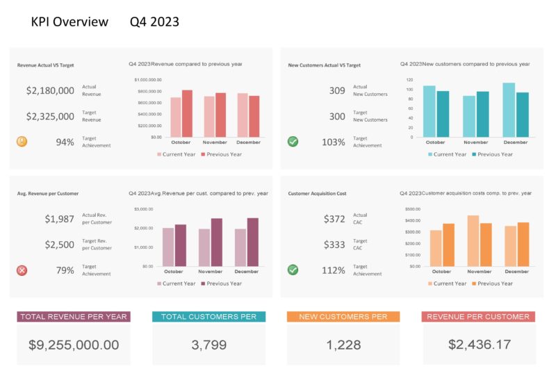
The power of our sales dashboard lies in its dynamism and simplicity. Just select the quarter from a dropdown menu, and voila! All your data visualization changes accordingly, presenting you with an overview of your sales performance for that quarter. This Excel template boasts robust data visualization capabilities, rivaling even Power BI reports. No advanced data analytics software is needed – it’s all in Excel!
Core Features of the Sales Dashboard
Customer Acquisition Details
One essential facet of any sales strategy is customer acquisition. Our dashboard provides an insightful view of your new customers, helping you understand who they are, where they’re coming from, and most importantly, the effectiveness of your acquisition strategies.
Revenue Growth Tracking
Revenue growth is a key indicator of business success. Our dashboard tracks your revenue growth over the selected quarter, giving you an instant picture of the health and growth of your business.
Target vs. Actual Revenue
Staying on top of your targets is crucial. This feature allows you to compare your revenue target against actual sales, thereby enabling a practical approach to your sales goals.
Average Revenue Per Customer
This KPI allows you to determine the average amount of revenue that each customer brings to your business. This insight can inform your pricing strategy and customer relationship management.
Customer Acquisition Cost Analysis
Understanding how much it costs to acquire a new customer can inform your marketing strategies and budget allocation. This feature provides a clear understanding of the cost-effectiveness of your customer acquisition strategies.
Yearly and Quarterly Trend Analysis
With the ability to view total revenue per year and the number of customers acquired in a year, you’ll gain a broader perspective on your business performance. Additionally, the quarterly trend analysis offers an in-depth view of your short-term sales trends.
How It Benefits Management, Sales, and Marketing Teams
Our dashboard’s visual nature and simple interface make it easy for the management team to interpret the data. It aids in making informed decisions, setting realistic targets, and monitoring the performance of the business against these targets.
For the sales team, the dashboard provides insights into their performance and potential areas for improvement. It empowers them to stay on track with targets and adjust their strategies where necessary.
Marketing teams benefit by gaining insights into customer acquisition costs and trends. This helps in refining marketing strategies and optimally allocating marketing resources.
In conclusion, our Quarterly Sales Dashboard in Excel is a free, dynamic, and powerful tool that can help your business transform data into actionable insights. It not only simplifies data management and interpretation but also promotes data-driven decision making across your sales and marketing teams. Download it today and experience the revolution in sales data management!

