If you wish to use drawing tools to create a timeline, there is no limit to what you can create and how creative you can get with the design of your timeline. However, if you want something more automated. You can create a timeline in Excel which is easy, especially if you are using Excel 2013 or later.
A Bubble Chart Timeline in Excel is a relatively a new type of XY Chart that uses a 3rd value (besides the X and Y coordinates) to define the size of the Bubble. Beginning with Excel 2013, the data labels for an XY or Bubble Chart series can simply define by selecting a range of cells that contain the labels. These features make it quiet easy to create some interesting timelines with a bubble chart.
Create a Bubble Chart Timeline in Excel
You can follow the steps below to create your own timeline from the scratch. The instructions for creating a horizontal timeline.
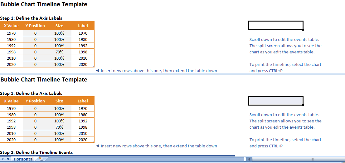
STEP 1: CREATE AXIS BUBBLE CHART SERIES
STEP 2: SECONDLY FORMAT X-AXIS LINE AND REMOVE LABELS
STEP 3: LIKEWISE CREATE CUSTOM AXIS LABELS WITHIN THE AXIS BUBBLES
STEP 4: ADD NEW DATA SERIES FOR THE TIMELINE EVENTS
STEP 5: ADD LEADER LINES AS Y ERROR BARS
STEP 6: ADD EVENT LABELS
STEP 7: MODIFY TIMELINE EVENT POSITIONS TO GET EVERYTHING TO FIT
WEIRD EXCEL BUG: LABELS NOT SHOWING UP?
If you save the file with some blank rows in the data table, when you open the file later you may find that the labels don’t show up in the chart when you add the labels into the blank rows. If this happens, You can delete the rows where the labels aren’t working and then insert new rows and re-enter the data.
Another work-around: In the Format Data Labels window
(1) Click on the Reset Label Text button,
(2) Uncheck Value From Cells options,
(3) Re-Check Value From Cells option.

