Download Pareto chart Template In Excel

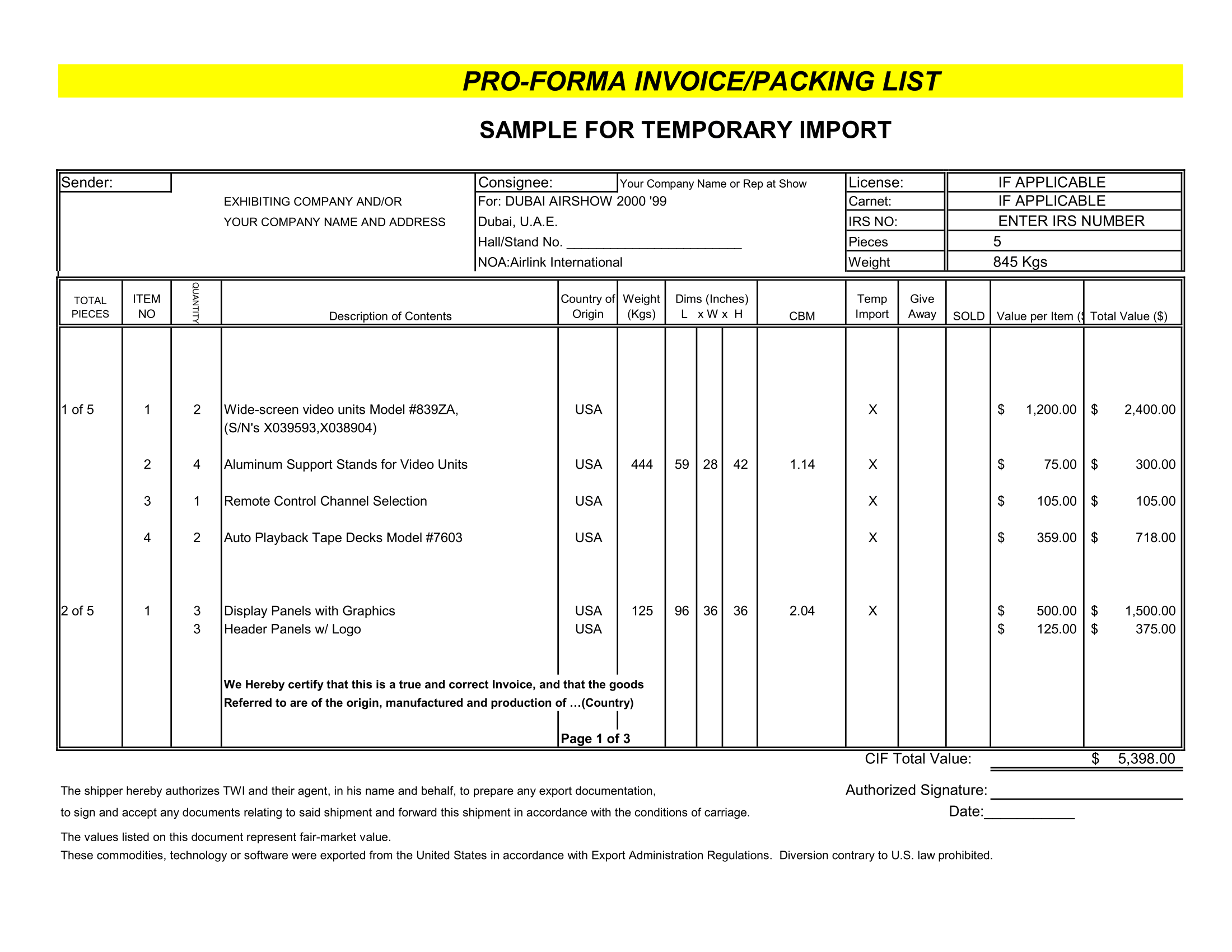
The Pareto Chart Excel template or Pareto Diagram, named after the famous economist Vilfredo Pareto (1848-1923), is a common tool for quality control and is used as part of a Pareto Analysis to visually identify the most important factors, most occurring defects, or the most common problems, or in other words “the vital few”.

What is a Pareto Chart or Pareto Graph?
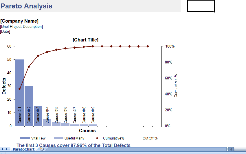
Pareto Chart (also called a Pareto Diagram or Pareto Graph) is a unique type of bar chart with the values order from largest to smallest and a superimposed line graph showing the cumulative total. The line graph uses the secondary axis (the axis on the right side) with values between 0% and 100%. In a Pareto Analysis, you simply look at where the line graph crosses 80% and the categories to the left of that point are your “vital few” or most significant factors.

Pareto Chart Excel

This spreadsheet template creates a Pareto Chart automatically as you enter the different factors. You can use this for quickly performing a Pareto Analysis to identify the most significant causes, defects, or problems. The values you enter can be defect counts, sales numbers, etc.

This template is a design pareto analysis report, ready for printing.

Pareto Analysis

The Pareto Principle, or 80-20 Rule, is a general rule-of-thumb or guideline that says that 80% of the effects stem from 20% of the causes. Vilfredo Pareto originally observe that in Italy, 80% of the land was owned by 20% of the people. Dr. Joseph M. Juran, a 20th century evangelist for quality management, applied this principal to quality control and preferred the use of the phrase “the vital few and the useful many” to describe the 80-20 rule. Although the actual numbers may be different from case-to-case, the Pareto Principle is a guiding principle used in business for …

  • Customer Complaints (e.g. 80% of the complaints come from 20% of the customers)
  • Management (e.g. 80% of the results come from 20% of the group)
  • Sales (e.g. 80% of the profits come from 20% of the products)
  • Quality Management for identifying the most important causes for defects (e.g. 80% of the problems come from 20% of the causes)

A pareto chart can help you quickly identify the most significant factors, but choosing which problems to fix may still require a cost-benefit analysis. If you have a single factor causing 50% of the problems, but it would cost you a million dollars to fix, and there are 3 other factors causing a total of 30% of the problems that would be much less expensive to fix, perhaps solving the 3 other factors first would be more beneficial.

The “Useful Many”

The categories in the “tail” of the chart used to be called the “trival many” or the insignificant factors. Dr. Juran later prefer to call them the “useful many”. They deserve at least a quick look. That is called a “just do it”.

What if one of the seemingly insignificant causes shown in your chart turn out to corelate with one of major causes? It might give you some insight into how to solve one of the more major problems.

When you do a Pareto Analysis involving factors that can be both general and specific such as in customer complaints, make sure you look at the “Useful Many” or the “Long-Tail” factors, because the more specific complaints may help you identify the root causes for the more general complaints.

Using the Pareto graph excel Template

Sorting the Values in Descending Order​

The one thing the pareto analysis worksheet does not do for you is sort your data from largest to smallest. However, I’ve set things up so that it is very easy to do. Just select the entire range of Causes and Defects (including the column labels) and go to Data > Sort to sort the data in descending order by Defects.

Adding/Deleting Categories

I’ve set up the formulas in the data-entry table below the chart so that you can easily delete rows or copy and insert rows, without messing up the formulas. You must insert rows below the first line or above the last line in the table so that the references to the table expand to include the new rows.

Download this Pareto chart template in Excel Format

Our easy to use editable Excel templates and save your significant amount of time and effort. Here’s how to download and use one of our templates:

  1. Download this free Excel Template: Once you’ve browsed through our collection of templates and find the one that best fits your needs. Once you’ve found the template you want, click on the download button.

  2. Replace sample data with your actual data: Once the template is downloaded, open it in Excel. You’ll see that it is already set up with sample data. To start analyzing your own data, simply replace the sample data with your actual data.

  3. Customize the template: Our templates are completely editable, which means you can customize them to fit your specific needs. For example, you can change the formatting, add or remove columns, or create new charts and graphs.

  4. Use the Excel template: Once you’ve fed in your data and customized the template, you’re ready to start using it for data analysis. Use the various tools and features of Excel to analyze and visualize your data, and make informed business decisions.

  5. Save and share: Once you’ve finished working on the template, save it to your computer and share it with other members of your team or stakeholders as needed.

Click Download Button To Get Pareto chart Excel Template

Instruction :

All Excel templates and tools are sole property of xlsxtemplates.com. User can only download and use the excel templates for their Personal use only. All templates provided by XLSX templates are free and no payment is asked. However, you are not allowed to distribute or share in any other website for sole purpose of generating revenue from it.

 You can also download and use our 1000 Best PowerPoint Presentation Templates and 500 Resume Samples from PPTXTemplates.com  Completely Free. All our templates are designed by Professionals

Download Free Editable Excel Templates | Popular Templates

Sales Invoice With Tracker

Sales Invoice With Tracker

In today’s fast-paced business world, sales invoices aren’t just about demanding payment. They’re part of an integrated system that can help businesses track sales, manage

Read More »
Project Wise Invoice Format in Excel

Project Wise Invoice Format

Project Wise Invoice Format: Your Comprehensive Tool for Accurate Project Billing Projects, especially in industries like construction, IT, or consulting, can often span months or

Read More »
Proforma Invoice

Proforma Invoice

Proforma Invoice Template: Streamlining Your Pre-Transaction Communications While many businesses are familiar with standard invoices, the realm of proforma invoices, serving as a precursor to

Read More »
Professional Service Invoice

Professional Service Invoice

Professional Service Invoice: Tailored for Expert Service Providers The realm of professional services is vast, encompassing consultants, advisors, trainers, and many others. What ties all

Read More »

Free editable professional Excel templates can be a useful tool for businesses, organizations, and individuals looking to streamline their data management and reporting processes. These templates can provide a pre-designed and pre-formatted framework for storing and organizing data, as well as for creating charts, graphs, and other visualizations to help communicate that data more effectively.

One advantage of using professional Excel templates is that they are often designed by experienced professionals who understand best practices for data management and visualization. This means that the templates are likely to be well-organized, easy to understand, and aesthetically pleasing, which can make working with them more efficient and enjoyable.

Another advantage is that these templates are often fully editable, allowing users to customize them to meet the specific needs of their organization or project. This can include adding or deleting rows and columns, changing the formatting and layout, and adding custom formulas and functions.

Some examples of professional Excel templates that may be available for free include budgeting templates for personal or business use, project management templates for tracking tasks and deadlines, and sales tracking templates for analyzing and forecasting sales data. There are also a wide variety of templates available for specific industries, such as real estate, marketing, human resource, Payroll management and among others.

Overall, free editable professional Excel templates can be a valuable resource for anyone looking to improve their data management and analysis skills. By providing a pre-designed and customizable framework for storing, organizing, and visualizing data, these templates can help users save time and make more informed decisions.