Everyone knows how well excel crunches numbers and manages data tables now a days. But it doesn’t get a lot of credit for its ability to present an appealing visualization of the data. In part, this is because it takes a bit of set-up and know to get Excel to operate visually. The Calendar Chart template that we have create with Excel allows users to understand data in a very different, more intuitive way than is possible when they are simply lists of numbers.
Calendar Chart Excel
While it might sound weird, it’s something most of us are already familiar with. One example is the Heat Map we see every time we open weather app. A heat map provides a visual comparison of temperature over given area. Think of a weather map representing the nation’s temperatures. The map is covered with areas of color—each representing a different temperature range.
Heat maps can also be used to represent quantity of an event or action. Consider the National Oceanic and Atmospheric Administration (NOAA) water vapor. The brown colors indicate little or no moisture content while the white, light-green, and dark-green colors represent higher vapor content in graph.
Calendar Graph Contents
This calendar chart comes with two worksheets.
2019
This is a one-year calendar (2019)
2019 2020 2021
This is a three-year calendar (2019, 2020 2021). It works same as the first worksheet but allows you to create a chart with extended data and forecasting.
2021 Calendar Chart
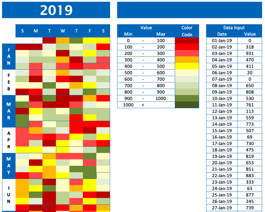
Now, let’s take a look at the template. After you download it, open up the first worksheet and you’ll see the four main components of a Calendar Heat Map: a key, the data, date range, and the chart of the dataset.
Excel Schedule Chart
Before we look at setup and how to use this template, I’ve created a couple of fictional datasets to help you understand basic visual patterns. In these examples, let’s imagine the dataset and represent how many stairs your fitness watch reports that you’ve climbed each day.
Calendar Chart JS
If we gathered data over multiple months and data showed a similar pattern, we could predict (with a high level of confidence) that we will be walking a lot of stairs towards the end of next month.
We can use this prediction to modify our actions for the event. Such as eating healthier towards the end of the month or making sure we get enough sleep so we’re ready for the extra workout. Because our stair climbing is less at the beginning of the month, we can be a little laxer on our preparation and still make it through the day without being exhausted.

