Harness the Power of Excel: The Essential Guide to Control Chart Templates
In an era abundant with statistical process control (SPC) software tools, many engineers still often find themselves creating control charts in Excel. Excel provides a flexible and accessible platform to build and customize your control charts. This blog post will introduce you to our Control Chart Template, designed as an educational tool to aid you in understanding the equations involved in setting control limits for a basic Shewhart control chart. Best of all? It’s 100% editable and free.
What Is the Control Chart Template?
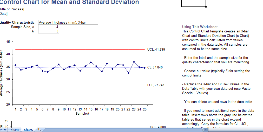
Our Control Chart Template houses a ready-made control chart for sample Mean and Range, or sample Mean and Standard Deviation (2 worksheets in one). You simply add your data and the control limits adjust based on the data you input. It’s a breeze to use!
This template supports the most common types of control charts: the X-Bar chart (which plots the mean of a sample over time), the R chart (which plots the range or Max-Min of a sample over time), and the S chart (which plots the sample standard deviation over time). These charts are critical tools used to routinely monitor quality.
Benefits of Process Control Charts
Control charts offer organizations a variety of advantages, particularly for those practicing continuous quality improvement. They help in:
- Facilitating Clear Communication: Control charts provide a simple, common language for discussing process performance and behavior.
- Guiding Decision Making: They inform decisions about which processes to leave alone and which to subject to an improvement cycle.
- Limiting Inspection Needs: With continuous monitoring, the need for repeated, detailed inspections decreases.
- Determining Process Capability: Control charts help understand process capability based on past performance and trends.
- Predicting Future Performance: If the system is stable and in control, control charts can help predict future performance.
- Assessing Process Changes: The impact of any process changes can be measured and visualized.
- Baseline for Future Improvements: They provide a graphical representation of the performance of a process over time, creating a baseline for future improvements.
Types of Control Charts
After the basic chart is established, you can utilize various menus and options to customize the chart’s format, type, or statistics. There are two broad categories of control charts:
- Control Charts for Variables: These charts can be classified based on the statistics of the subgroup summary plotted on the chart. X¯ charts describe the subset of averages or means, R charts display the subgroup ranges, and S charts show the subgroup standard deviations.
- Control Charts for Attributes: This type of data is usually continuous and based on the theoretical concept of continuous data. They are best suited for discrete count data, such as the number of defects per subgroup.
Unique Features of Control Charts
Our Control Chart Template offers several unique features, including:
- Points Representing Statistics: These indicate measurements of a quality characteristic in samples taken from the process data at different times. The statistic could be a mean, range, proportion, etc.
- Calculated Mean and Standard Deviation: For all samples, the mean and standard deviation of the statistic is calculated.
- Centerline at the Mean: A centerline is drawn at the mean of the statistic.
- Natural Process Limits Indication: Upper and lower control limits indicate the point at which the process output is considered statistically ‘unlikely’. These are typically drawn at three standard deviations from the centerline.
Why Choose Our Templates?
Our control chart templates are intuitive, user-friendly, and 100% editable. They’re designed not just as tools, but as learning aids, helping you understand the statistics and equations that underpin the control charts. And best of all, they’re free. In this fast-paced, data-driven world, our templates offer you a reliable way to monitor, assess, and improve your processes with ease. So why wait? Embrace the power of control charts with our free editable Excel templates today.
Levey Jennings Charts
Another type of control chart that you can create using our template is the Levey Jennings chart. This type of chart displays a process mean based on long-term sigma, with control limits set such that the distance between them and the centerline is ‘3s’. Here, ‘s’ denotes the standard deviation, and the method to determine ‘s’ for these charts is the same as the standard deviation for the distribution platform.
The Journey to Creating a Control Chart
There’s no need to fret if you’re unsure about the name or structure of any chart. Our template simplifies the process for you. Start by selecting the columns or variables that need to be charted and drag them into the respective zones. Once the data column is placed in the workspace, you can start working on creating an accurate chart based on the data type and sample size.
Our templates cater to every user, regardless of their familiarity with control charts. They offer an easy-to-use interface that enables quick data entry and provides a visual representation of the data that’s intuitive to understand.
Conclusion
Whether you’re looking to monitor process performance, assess process changes, or visualize the performance of a process over time, control charts serve as an excellent tool. And with our free editable Excel templates, creating control charts becomes a streamlined process that’s easy and hassle-free.
Our templates offer a dynamic approach to traditional statistical process control. They’re designed to adapt to your data, rendering them versatile for a range of applications. And because they’re 100% editable, you can tweak them to meet your specific needs.
So why wait? Unleash the power of control charts in your quality control processes today. Choose our free, editable Excel control chart templates – a comprehensive solution to your statistical process control needs.
Get Started Now!
Experience the difference that a well-structured, easy-to-use control chart can make in your quality control processes. Visit our website to download our free, editable Excel control chart templates. Your journey towards improved quality control begins here!